Prologue
Before I continue my adventures from the previous post, I would like to state a few facts that may not have been obvious there.
- I personally have no experience programming or designing fonts; the closest I had come to the subject of fonts was when I tried using LaTeX, and that was mostly making sure the required font file was not missing during rendering.
- Even though I do read and write Malayalam (and it is supposed to be my native language), I am not very fluent in reading and writing. My fluency in speaking is somewhat fine, but I still wouldn’t be able to speak with what is expected as “native proficiency”.
- The history of Malayalam being used in computers and fonts is quite deep and nuanced. If you would like to deep dive more into how Malayalam fonts evolved, I highly recommend the article by Ashik, which covers how we started with hacking ASCII fonts to render Malayalam glyphs, to finally getting aesthetically pleasing fonts like Rachana and Manjari, thanks to non-profit movements like Rachana Institute of Typography and Swathanthra Malayalam Computing respectively.
LLMs have entered the picture
It has been a while (almost a year) since I revisited the problem of displaying Malayalam in the LED badge; 39c3 happened and the LED badge was not on my list of things to handle. On the other hand, I have been using LLMs to various extents to solve problems, especially ones where I do not have much experience with the code itself but I understand the domain of the problem — a lot of it has been in areas of packaging and utilities like btop / htop / glances etc.
LLMs in particular have been super helpful for me:
- Searching and consolidating results on various topics.
- Helping me make significant changes in a language I am not too familiar with, e.g. Nix, HTML / CSS, TypeScript, etc.
- (Re)Learning about topics where I do not have in-depth knowledge, like the inner workings of tools like psutil, or debugging threads using gdb.
With the growth of LLMs, there has also been a rise of AI slop, and this also applies to generated code. Since most of the technical use cases of LLMs I use have been within domains I have some familiarity with, I had not tried to use LLMs to get work done in a totally unfamiliar domain — until now.
Also, I got a Claude subscription in March and wanted to see how much I could push it.
Attempt 1 - Automating the Font to Image pipeline
As an initial step I fed Claude with the existing work I had done and asked it to state its understanding of the project. It went through my working folder and figured out all the snippets I had been using to try to display Malayalam in the LED badge.
Once this was done, I gave it a prompt (recollecting from my memory) similar to the one below:
Using the attempts done so far, come up with a way to convert a given font to the PNG that can be used for displaying in the LED badge. Write the solution using python.
The prompt is kept intentionally naive because I still do not know much about the inner workings of a font. And I also wanted to check what Claude would attempt to come up with.
Claude churned for a while and, after a bit of back and forth, came up with a Python (~400 lines) pipeline based on the snippet I was working with, the Go + FreeType example.
In a nutshell this is what it came up with:
  %%{init: {
    "theme": "base",
    "themeVariables": {
      "background": "#101014",
      "primaryColor": "#1c1c24",
      "primaryTextColor": "#e6e6ea",
      "primaryBorderColor": "#8a6b2f",
      "lineColor": "#e8a530",
      "edgeLabelBackground": "#24241c",
      "fontFamily": "ui-monospace, monospace",
      "fontSize": "13px"
    },
    "flowchart": { "nodeSpacing": 40, "rankSpacing": 40, "subGraphTitleMargin": { "top": 8, "bottom": 18 } }
  }}%%
  flowchart TB
      in(["text + font.ttf"])

      subgraph s1["① Size"]
        cal["<b>calibrate ppem</b><br/>largest where<br/>ascender + descender ≤ 44<br/>(11 px × 4 supersample)<br/><i>declared metrics, not ink</i>"]
      end

      subgraph s2["② Shape"]
        hb["HarfBuzz shape<br/><i>conjuncts, matra reorder, marks</i>"]
        place["lay out<br/>width = Σ x_advance;<br/>baseline centred via<br/>ascender / descender"]
        hb --> place
      end

      subgraph s3["③ Rasterize hi-res · 44 px"]
        raster["FreeType FT_LOAD_RENDER<br/>grayscale, per glyph"]
        blit["max-blit at<br/>HarfBuzz positions"]
        norm1["normalize → 0–255"]
        raster --> blit --> norm1
      end

      subgraph s4["④ Reduce to 1-bit"]
        down["LANCZOS ↓ 44 → 11 px<br/><i>anti-aliases edges</i>"]
        norm2["normalize again<br/><i>thin strokes lost amplitude</i>"]
        thr["threshold ≥ 128"]
        down --> norm2 --> thr
      end

      out(["11 px · 1-bit · white-on-black PNG"])

      in --> cal --> hb
      place --> raster
      norm1 --> down
      thr --> out

      classDef stage fill:#1c1c24,stroke:#8a6b2f,color:#e6e6ea,stroke-width:1.5px
      classDef flaw fill:#3a2416,stroke:#e8a530,color:#ffd977,stroke-width:2.5px
      classDef io fill:#1c241c,stroke:#e8a530,color:#e6e6ea,stroke-width:2px

      class hb,place,raster,blit,norm1,down,norm2,thr stage
      class cal flaw
      class in,out io
I still did not understand many of the details of the steps, like the formula for the width being calculated, how Lanczos filters worked and why it was being used here, etc.
Again I went with “കേരളം” and, to no one’s surprise, the output was terrible; if you squint enough you may be able to make out some of the glyphs, but this was far from an approximation that could be used on an LED badge.


Looking at the two, I understood that, with the threshold, it just turned those pixels either fully white or fully black to achieve the 1-bit needed. This also meant I needed a smarter way to figure out which pixel to turn on or off.
Unexpected happy coincidence - The LED Simulator
Even though the rendered PNG was terrible, the terribleness was also displayed in my terminal screen. And it almost looked similar to the output I would expect to see on the LED badge. After tweaking a bit and making the layout have a border, it looked pretty close to the actual output.
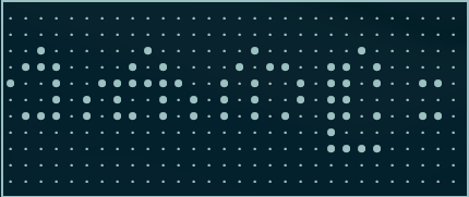
So I decided to render “Keralam” with the Terminal Vector font, and it rendered correctly, though the “m” is chopped off because it is outside the LED badge’s width.
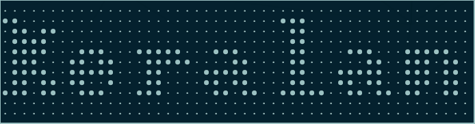
I am not sure why the LLM decided a simulator would be nice to have; it had no instructions from me at any point to create one. My initial attempts were about generating the PNG and pushing it to the LED badge directly. The simulator also saved me from opening up the image file every time I render; instead I can see more or less what is expected to be shown on the LED badge.
Attempt 2 - Handcrafting the glyphs
Without much success with the above approach, I asked around a bit in the Gen AI Kerala telegram group about this problem I was facing. KP (a friend of mine) pointed me to a GitHub repository, MAX7219-Malayalam, which says:
Cascaded Malayalam Scrolling text display using MAX7219 dot matrix and Arduino. Displays മലയാളം (Malayalam, a native Indian language) in LED matrix display.
This is more or less what I want to achieve, and looking at the font, it seems to be divided into upper and lower halves.
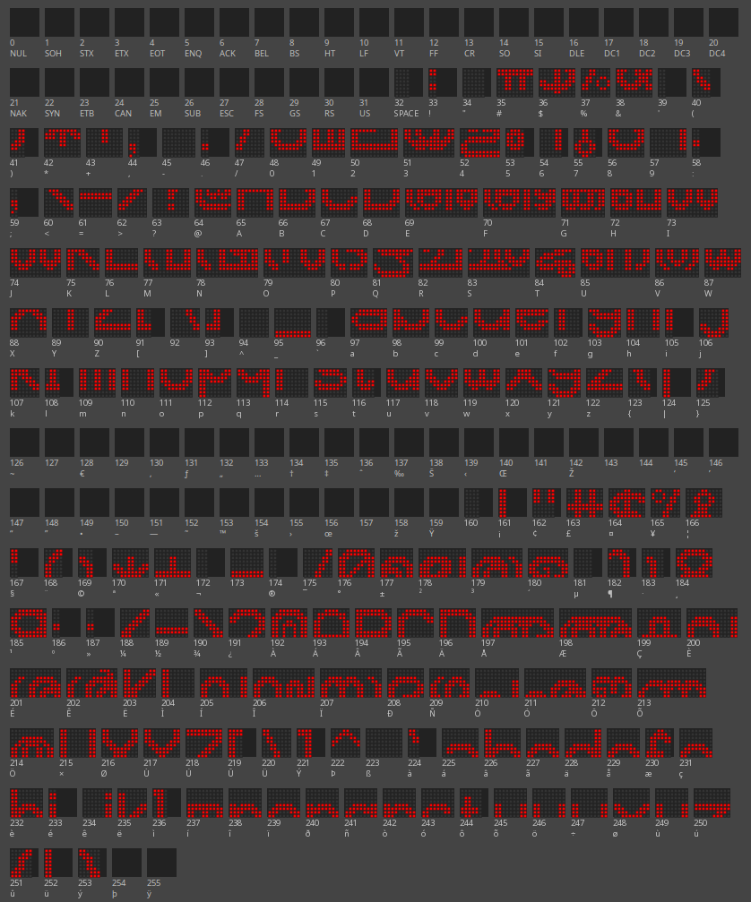
KP and I sat down with Claude together (KP has not worked with fonts either), and asked it to explain how the fonts are packed into a 16-row display made of two stacked 8-px module zones.
Claude’s explanation
Worked example — reconstructing മ (ma) across the two zones:
‘മ’ lives at lower index 49 and upper index 177 in BigFont:
lower (49):  9,  63, 63, 48, 48, 63, 63, 48, 63, 63     // bottom 8 rows
upper (177): 9, 240,248,124,108,236,204, 28,248,240     // top 8 rows
Width 9, so 9 column bytes each. Decoding with the Parola rule (bit 7 = bottom row of that byte’s 8-row block, bit 0 = top row) and stacking upper (rows 0–7) above lower (rows 8–15):
col:      012345678
row 2:    ..#####..
row 3:    .#######.
row 4:    ###...###
row 5:    #####..##      ← upper zone (top-half glyph, index 177)
row 6:    ######.##
row 7:    ##..##.##
──────────────────────── module boundary (8 px)
row 8:    ##..##.##
row 9:    ##..##.##
row 10:   ##..##.##      ← lower zone (bottom-half glyph, index 49)
row 11:   ##..##.##
row 12:   #########
row 13:   #########
The two independently-clocked 8-row halves line up into one recognizable മ. That is the whole trick.
More rabbit holes
My thought was: if we can halve the double-height font, we can probably get it to display on the 11 px high LED badge. This excellent article by marco_c explains how text rendering works within the context of an Arduino-based LED matrix.
The article explains how double-height fonts work and the utility to do this. We asked Claude to go through it and write up an algorithm to halve the height of the fonts, which in theory should fit the LED badge.
After much back and forth we ended up in the same pitfalls as the dumb approach in Attempt 1.

This approach was not only objectively worse, but even if we got some of the basic glyphs to work, it could not handle the complicated cases Malayalam requires.
Primarily these two:
- It is not one glyph per character. Malayalam is an abugida: a base consonant carries an inherent vowel, and vowel signs (matras) attach around it — left, right, above, below, or wrapped on both sides. The visual unit is the akshara (orthographic syllable), not the Unicode codepoint. കു (ku) is one visual blob assembled from ക + ു.
- Consonants stack into conjuncts. A “virama” (chandrakkala, ്) between two consonants requests a conjunct. In traditional orthography many of these stack the two consonants vertically — ക്ക (kka), ണ്ണ (ṇṇa), സ്ത്ര (stra) — piling ink up and down. This vertical stacking is the single biggest threat to a fixed-height strip: two consonants plus a top and bottom vowel mark can occupy roughly 2× the vertical span of a bare letter.
Epilogue
Using LLMs going in blind is probably not the right way to do this. I am still missing some key aspects that I need in order to understand the basic problem I am trying to solve, why I am hitting these limitations, and how to come up with workarounds for them.
Handcrafting the glyphs like in Parola is an option, but is not sustainable or scalable.
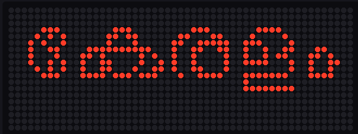
In the meantime Santhosh Thottingal, the author of many popular Malayalam fonts, wrote up an LED simulator for Malayalam, and you can access the source code. This also gave me an opportunity to test things out from an independent approach.
With a height of 20 LEDs the rendering looks pretty good:
When I reduced that to 11 LEDs:
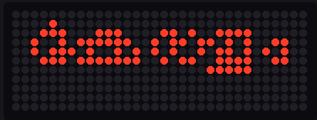
Comparison with the conversion I did:
Santhosh goes on to give a very good explanation of how the rendering is done and how it works. Coincidentally, it is also very similar to the dumb conversion I came up with by prompting Claude. This also made me understand which tooling is important for font manipulation (FreeType, HarfBuzz, freetype-demos).
The most visible difference between our two approaches is where we decide which pixels to light:
- Claude’s approach uses
FT_LOAD_RENDER, which renders the glyph to grayscale (at 4× the needed height), then runs the Lanczos algorithm to scale it down to 11 px, and only then thresholds to decide whether each LED is lit. The catch is that by the time we threshold, the shape has already been rasterized and resampled, and the threshold has no deterministic control over which pixel ends up on — a thin stroke can smear across two columns or vanish depending on where its grey falls relative to the cut. - Santhosh’s approach is a lot simpler: it uses FreeType’s mono rasterizer
(
FT_LOAD_TARGET_MONO), which decides on/off directly at the target grid — no grey, and no resampling to muddy the call.
That difference explains why my output looks worse than Santhosh’s: the extra resample-then-threshold step is sloppier than deciding on/off up front. But it does not explain why both of us end up hard to read — and this is the part I only half-understood at the time. Looking at Santhosh’s render: there are unused pixels at the bottom and a whole row that never lights. The glyph is being drawn small, floating in the strip instead of filling it, and at that size there simply aren’t enough pixels to keep Malayalam’s stacks apart. The rasterizer is not the root problem — how big the glyph gets drawn is.
This gave me a gut feeling that something was off in both our approaches, and I still did not understand why things go crazy when the height drops below a certain threshold. But I had a feeling that if I hit the LLM with the right prompt, I could probably ask it for a better way to do this.