- Prologue
- Fonts and Rasterization
- Asking LLMs the right question
- The birth of
pixelshaper - Revisiting the Malayalam LED Simulator
- Extending beyond Malayalam fonts and more
- Epilogue
Prologue
One of my pastime activities is watching YouTube videos while sipping a beer. I generally watch videos on topics of science, technology and sometimes I watch videos on things I wished I had known and worked on but never did. And one day I got suggested a video from a channel called Sebastian Lague who has a series called Coding Adventure. His videos have amazing and eye-pleasing animations, and a soothing voice explaining complex concepts to a beginner. While browsing his collection of videos I came across one titled Coding Adventure: Rendering Text.
Fonts and Rasterization
In Sebastian’s video he goes on to explain how fonts themselves have a really complex specification and more specifically how you rasterize fonts for low resolution displays (like an LED badge). Even though the section is quite small, I went through the original document by Microsoft called Fixing rasterization issues. This document also visualized for me the exact nature of the problem I was facing.
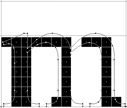
The TL;DR is, it is not trivial and there is a lot of math and manual work (font hinting) involved and this kind of pointed back to what Ashik had mentioned in my earlier post about building the glyphs by hand for low resolution displays.
Sebastian goes on to the required tables within a font specification and
then discusses glyf tables, how to figure out the points connecting the parts
of the glyph, and then came the pièce de résistance, Bézier curves.
Bézier curves
Back in school (and later in college), my basic intuition for visualizing things in 2-D coordinate geometry wasn’t so great. And in my 6th semester in college, I came across the concept of Splines and Bézier curves.
To some extent it frustrated me in two ways,
- I had to now re-learn some of the old formulas used for these, specifically linear interpolation.
- My skills in visualization were still very weak.
Bézier curves (especially the cubic and quadratic varieties) play an important part in shaping paths, for example a racing track layout in a game, but the same technique is also used for deciding curves in a font’s glyph.
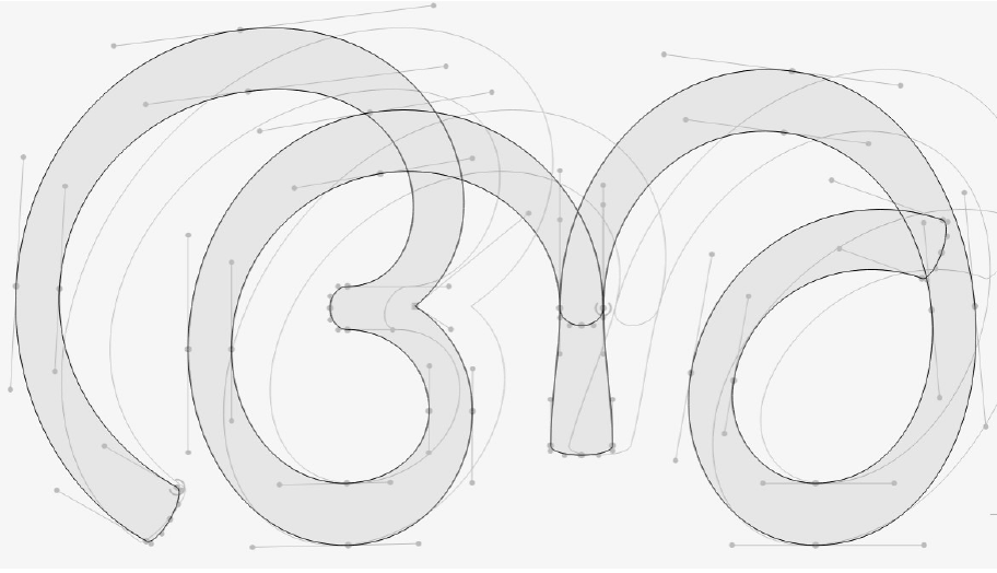
Santhosh Thottingal in his paper titled Parametric type design in the era of variable and color fonts illustrates how glyphs in Malayalam have different curves by taking the example of a single glyph “അ”, where he shows how slanting can be applied to the glyph.
Asking LLMs the right question
With this newfound knowledge, half drunk, I decided to ask the LLM
Compare Nupuram-dots and k8x12 fonts, tell me what is fundamentally different between them.
The reason for choosing Nupuram-dots was I was still under the illusion that “dots” would make it more friendly for the LED badge display.
Claude went on to explain (abbreviated)
k8x12 (the pixel font I had been using for ASCII text on the badge) is an outline TTF whose outlines are pixel squares — rendering at its design size is pixel-perfect. Malayalam can never be “one codepoint = one glyph” (conjuncts, chillus, matra reordering), but the shaping machinery is independent of what outlines look like.
When asked
Is it possible to get a k8x12 like format for malayalam?
I also hinted to use something like FontForge, Claude replied
split “k8x12-like” into two properties (fixed pixel grid; what transfers to Malayalam).
When I probed further
“Is a monospaced Malayalam font technically possible?” and “theoretical minimum pixel height for Malayalam?”
Claude estimated 11px should be sufficient and was able to render “മലയാളം” (Malayalam).
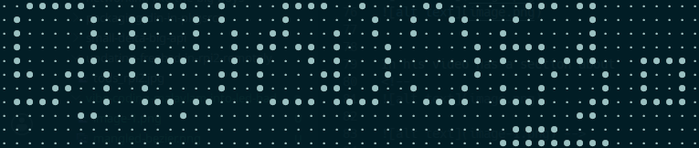
This is better than most of the other brute force attempts I did, so I went ahead.
Nupuram almost renders with a few pixels off, is it possible to create a ttf based on nupuram but for led display where the currently rendered font is mapped like k8x12 and then handedited and fixed?
Claude replied
(1) auto-rasterize every glyph at target ppem
(2) vectorize k8x12-style as pixel-square contours
(3) quantize hmtx advances + GPOS anchors to the grid
(4) keep cmap/GSUB/GPOS verbatim so HarfBuzz shapes identically
(5) Hand-edit loop. Rather than nudging squares in FontForge, I’d make the source of truth a directory of text-art bitmaps — one small ●· grid file per glyph, exactly like the previews you’ve been reading in the terminal — with a fontTools script that compiles the directory into the TTF. Fixing a glyph = editing characters in a text file and recompiling. That’s also a workflow where you can hand me ‘ഷ്’s mark is one pixel too low’ and I can fix it directly.
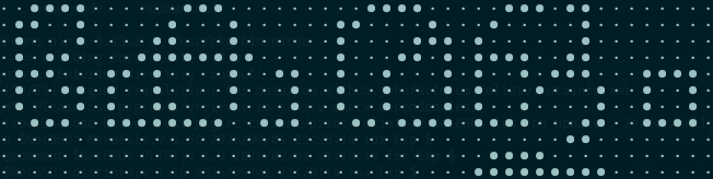
So this time I went with the classic example I have been using in my previous posts “കേരളം” (Keralam)
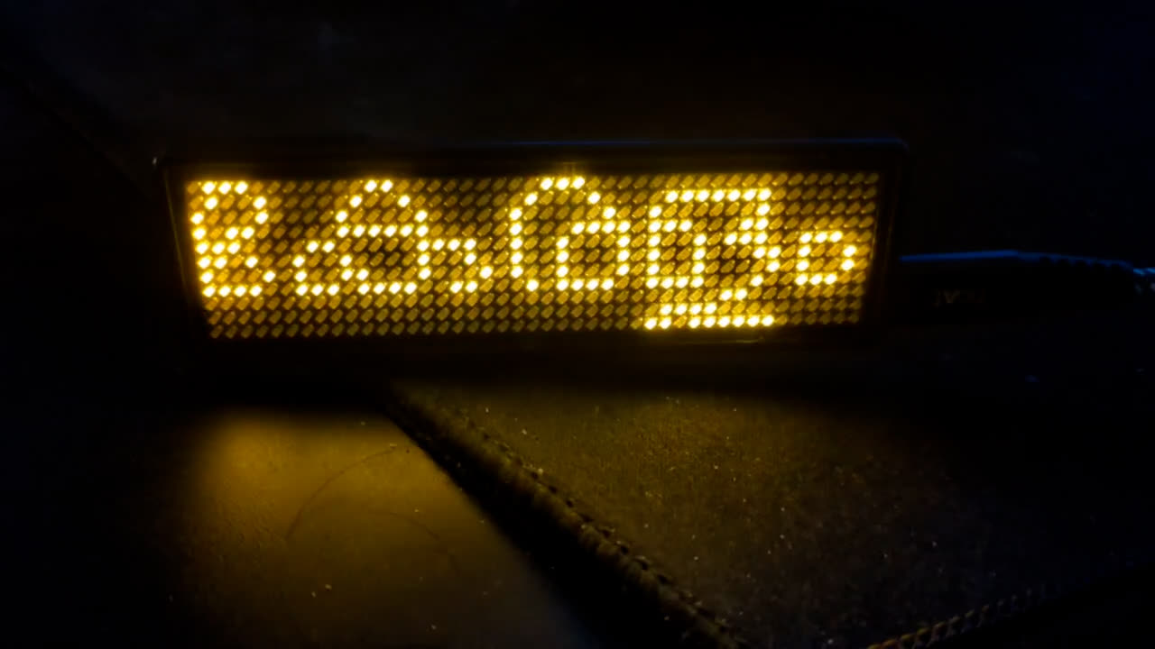
But how would it look when I push it to the badge?
Even though the LLM had made a breakthrough, I had no code to show for it and I needed to formalize this.
You can read the historical context of the conversational exchange if you are interested.
The birth of pixelshaper
The next day, I asked Claude to formalize this and make an application out of it. The choice of Python as the language was biased: since the Malayalam LED Simulator and the LED name badge tooling were written in Python, I stuck to the pattern.
Why does Malayalam (and other Indic family) have this problem?
As stated by Claude
Outline fonts fail on tiny pixel grids (LED matrices, e-paper tickers, embedded displays) for a precise reason: below ~12 pixels per em, strokes go sub-pixel and every edge rounds arbitrarily — nobody decides which pixel a stroke owns. Classic pixel fonts (k8x12, Terminal Vector) solve this by hand-drawing every glyph on a fixed grid, but they exist only for scripts where one codepoint is one glyph. Complex scripts — Malayalam, Devanagari, Arabic — need a shaping engine to form conjuncts, reorder vowel signs, and position marks, and no pixel-font toolchain speaks shaping. Consequently, no Indic pixel-font ecosystem exists.
I could not have put it better myself, but as with any LLM the claim below ~12 ppem may not be a hard limit depending on the glyphs used for display. This is more visible as we get into the examples.
This also gave me insights into why text in Santhosh’s Malayalam LED Simulator became illegible at lower pixel height values.
Basic Terminology
Before I go into the details, let me run through some quick terminology in
typography that needs explanation. Of course none of this explanation is by me,
it was done by the LLM. But it also helped me understand what it was trying to
do. The concept of em is something I do not fully grasp, but it also plays a
crucial role in rendering the text in LED badge.
-
Donor Font
A Donor Font is nothing but the actual font that has the outline glyphs, from which we will generate a new font whose outlines are replaced with the equivalent pixel / bitmap ones.
-
emandppemThe
emis the font’s design canvas — the square of abstract space inside which every glyph is drawn, and the unit that all font measurements are expressed in.In a digital font, the
emis a coordinate grid. The font picks a resolution for it — units perem(upem): 1000 for PostScript-heritage fonts, 2048 for TrueType (Manjari, Mukta, Noto), sometimes 1024 or 4096.The
emis nominal, not a bounding box. Glyphs may — and do — extend outside it. Latin’s f and j nose out a little; Malayalam breaks it spectacularly: a traditional-orthography stack like സ്ത്രീ piles marks below the base until the ink span exceeds theementirely.ppem= pixels perem— the number of pixels the font’semoccupies when rendered. It’s the single number that converts between the font’s abstract design space and the actual pixel grid. -
cmap— characters → glyphs (the entry point)The character map answers one question: “Unicode codepoint U+0D15 (ക) — which glyph ID in this font draws it?” It’s a simple lookup table, and it’s the only table that deals in Unicode at all. Everything after
cmapoperates purely on glyph IDs.The crucial limitation:
cmapmaps one codepoint to one glyph. That’s fine for Latin A, but Malayalam ക്ഷ is three codepoints (ക + ് + ഷ) that must become one drawn shape —cmapcan’t express that. It also can’t be reached “backwards”: a conjunct glyph like ക്ഷ has no codepoint of its own, so it’s invisible tocmapentirely. This is why you can’t test a pixel font by just typing characters into a dumb renderer — anything beyond the base alphabet only exists past the next table. -
GSUB— glyph substitution (which glyphs)GSUBrewrites the glyph sequence aftercmap. It holds rules — organized by script/language and OpenType features (akhn, pref, blwf, liga, …) — of the form “this sequence of glyph IDs becomes that one” (and other flavors: one→many, one glyph→a contextual alternate, etc.).All the Malayalam behavior we’ve been wrestling with lives here:
- ക + ് + ഷ → the single ക്ഷ conjunct glyph (akhn — the substitution we added the conjunct trace for in pixelshaper).
- ് + യ → the ്യ sign form — and which glyph the rule targets matters: for a word like കമ്പ്യൂട്ടിങ് (“computing”), Noto substitutes a compact right-attached hook glyph while Manjari substitutes a deep below-base loop glyph, so Noto fits more of the strip height.
- ര + ് reordered prefixed form, chillu formation (ന + ് + ZWJ → ൻ), etc.
Key insight for our pipeline:
GSUBdecides which drawings appear. Whenpixelshaperbakes a pixel font, the donor’sGSUBis what makes the conjunct glyphs reachable at all — our traced art replaces the outlines, but the substitution rules routing text onto those glyphs come from the donor font. -
GPOS— glyph positioning (where they go)After
GSUBhas settled which glyphs exist,GPOSadjusts their coordinates: kerning pairs (move A and V closer), mark attachment (place a vowel sign relative to an anchor point on its base — e.g. snapping ു to the right spot under different-width bases), cursive connection, mark-to-mark stacking. Rules are again grouped under features (kern, mark, mkmk, abvm, blwm).GPOSnever changes what is drawn, only offsets and advances. In our 11 px world this is the table whose effects you see as sub-pixel-ish nudges that then get quantized: aGPOSmark anchor that places ്യ 0.3 px lower in em-space can be the difference between the stack fitting the strip or clipping below it once rounded to the pixel grid.
Engineering or The Art of Approximation
As an Engineer you almost always never get what you want so you end up approximating what you have.
Fonts in computers are as much Aesthetics as Engineering. A lot of mathematics goes into making sure a glyph in a font is very accurately represented. Fonts not only capture the text to be displayed but also the style in which it is displayed, “blocky” / “cursive” etc. Malayalam (as with many Indic languages) has a very curvy appearance and in addition to this we also have Pazhaya Lipi (Old Script) vs Puthiya Lipi (New Script). This orthography reform is a more recent change (formalized in 1971) to accommodate the printing press, reducing the number of glyphs from about 1000 to 250. With the advent of the digital age we ended up using both the old and new scripts and even combinations of both.
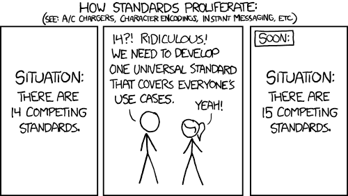
Here are some of the Engineering decisions I took while making pixelshaper.
- The aim is to not convert every possible glyph to a pixel / bitmap representation.
- The conversion glyphs are decided by the Corpus of text we want to display in
the LED badge
- This is a small 11 x 44 display. We do not intend to display large quantities of text in this.
- Depending on the glyphs used, we can have favorable heights to display the characters, we do not need to take a global decision on the height based on all possible combination of glyphs.
- Reducing the glyphs to 11px height also means curves are now defined by pixels going in diagonally, which over a distance would make more sense than up close.
- Using text-art glyphs for editing was a deliberate choice to keep the editing of the pixels (which can either be in an On state or Off State) simple and requiring nothing more than a text editor to work with.
This incidentally also drastically reduces the number of glyphs we need to hand edit manually.
Text-art representation
Claude chose to have the glyph name, the advance (how many pixels the pen
moves after this glyph), and the left and top of the glyph.
We use · for a pixel turned off and ● for pixel turned on, and a <space>
between every point to closely match the spacing of the LEDs in a display.
The below example shows k1 (ക) extracted from Manjari Font but now in a
bitmap / pixel representation.
name: k1
advance: 13
left: 0
top: 7

· · · · · ● ● ● · · · · ·
· · · · ● · · · ● · · · ·
· · · · ● ● ● ● ● ● · · ·
· · ● ● ● ● ● ● ● ● ● · ·
· ● · · ● · · · ● · · ● ·
· ● · · ● ● · ● ● · · ● ·
· · ● ● ● ● ● ● ● · ● · ·
· · · · · · · · · · · · ·
The naming convention of glyphs (k1 for ക, k2 for ഖ etc.) is devised by K.H. Hussain in 2005 to form a mnemonic way to represent conjuncts and its components and to facilitate the coding of glyph substitution of conjuncts.
The conversion algorithm
Putting all the above together, this is what we have come up with.
%%{init: {
"theme": "base",
"themeVariables": {
"background": "#101014",
"primaryColor": "#1c1c24",
"primaryTextColor": "#e6e6ea",
"primaryBorderColor": "#8a6b2f",
"lineColor": "#e8a530",
"edgeLabelBackground": "#24241c",
"fontFamily": "ui-monospace, monospace",
"fontSize": "14px"
},
"flowchart": { "nodeSpacing": 60, "rankSpacing": 75 }
}}%%
flowchart TD
donor(["donor.ttf<br/><i>cmap / GSUB / GPOS</i>"])
inventory(["glyph inventory<br/><i>every conjunct, ligature and mark<br/>the corpus actually uses</i>"])
art(["glyphs/<name>.txt<br/><b>●/· text-art grids — the source of truth</b><br/><i>⟳ hand-edit · rebuild · judge on hardware</i>"])
ttf(["build/Family.ttf<br/><i>shapes identically to the donor;<br/>pixel-perfect at its native ppem (stamped)</i>"])
donor -- "<span style='display:inline-block;border:1px solid #8a6b2f;border-radius:4px;padding:1px 6px;background:#24241c'>shape corpus (HarfBuzz)</span>" --> inventory
inventory -- "<span style='display:inline-block;border:1px solid #8a6b2f;border-radius:4px;padding:1px 6px;background:#24241c'>rasterize + threshold<br/>at one ppem</span>" --> art
art -- "<span style='display:inline-block;border:1px solid #8a6b2f;border-radius:4px;padding:1px 6px;background:#24241c'>pixel-square outlines;<br/>quantize to<br/>the grid</span>" --> ttf
donor -. "<span style='display:inline-block;border:1px solid #8a6b2f;border-radius:4px;padding:1px 6px;background:#24241c'>shaping tables pass through verbatim</span>" .-> ttf
art -- "<span style='display:inline-block;border:1px solid #8a6b2f;border-radius:4px;padding:1px 6px;background:#24241c'>⟳ hand-edit</span>" --> art
classDef stage fill:#1c1c24,stroke:#8a6b2f,color:#e6e6ea,stroke-width:1.5px
classDef truth fill:#2a2113,stroke:#ffb000,color:#ffd977,stroke-width:2.5px
classDef result fill:#1c241c,stroke:#e8a530,color:#e6e6ea,stroke-width:2px
class donor,inventory stage
class art truth
class ttf result
The end result is the pixelized version of the Donor font. You can see a full
example output for Manjari and Nupuram conversions at the
pixelshaper repository, including the text art and the output pixel
font.
The examples I am using here are cherry picked, without much complexity in the
glyphs. An example of a more complex glyph is when we double stack the same
letter. An example of this is ശ്ശ, which is the stacked form of ശ, and its
use is similar to how ss is used in English. The place in Kerala called
Thalassery is written in Malayalam as തലശ്ശേരി, and the place is also the
origin of Thalassery Dum Biryani.
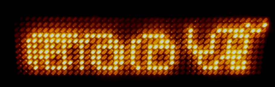
The stacked ശ്ശ was extremely mangled by the auto conversion, and had to be
hand fixed to get a legible form.
name: z1z1
advance: 13
left: 0
top: 8

· ● · · · · ● ● ● ● ● · ·
· ● · · · ● · · · ● ● ● ·
· ● · · · ● · · ● · · ● ·
· ● ● · · ● · · ● · · ● ·
· · ● ● ● ● · · ● ● ● ● ·
· · · ● · · · ● ● ● ● · ·
· · · ● · · ● · · ● · ● ·
· · · · ● ● ● · · ● ● ● ·
These complex shapes are also what makes designing fonts used in Malayalam quite a non-trivial task. They change not only in width but also in height, which presents its own problems when trying to render such fonts in terminal.
Revisiting the Malayalam LED Simulator
Once I got things working in the actual LED badge, it was time I revisited the Malayalam LED Simulator and this time around I also understood why the letters become completely illegible below a certain height: without a deterministic decision on which pixel a stroke owns, the pathways become mangled.
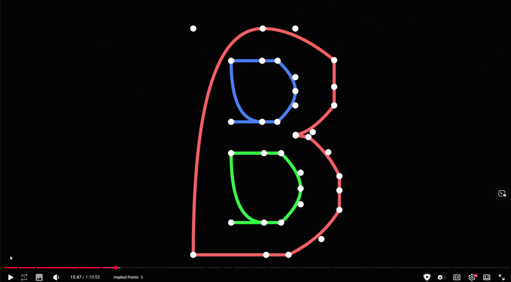
In the case of a script like Malayalam, as the height gets smaller, the scaled outline coordinates land between pixels — strokes go sub-pixel — and the rounding decisions become arbitrary, mangling the curves.
Santhosh goes into nice details explaining this in his Malayalam LED
Simulator’s landing page, taking the example of ക, and to keep continuity
I am going to take the same example and extend it. The reason why the letters
become illegible at 11 px height is because the ppem (Pixels Per em) is keyed to
the tallest conjunct stack in the whole test corpus, which for Manjari computes
to roughly 9 ppem. If we instead allow scaling based on the ink of just the
text being displayed, you get a better representation of ക at roughly 21.5
ppem. And if there is a native pixel font built from a wider corpus sampling,
we can tune where this lands — for example the conversion of Manjari to pixel
resulted in a 14 ppem font.
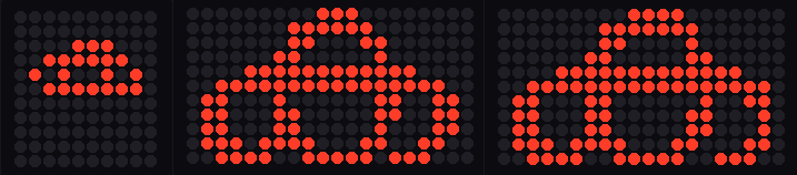
As you can see the existing Manjari font without much modification can be used to display simple glyphs without a lot of distortion. However you can also see the conversion is not perfect: there are double-width strokes or excess pixels turned on / off depending on the scaling. Since Native Pixel does not exist in Manjari, it is equivalent to using “Self-scaled Outline”.
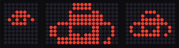
With the pixel variation of Manjari, under “Uniform” it still suffers the same
issue, but with “Self-scaled Outline” suddenly we have far more excess pixels,
because now the 14 ppem font got blown up to 21.5 ppem. Under “Native Pixel”
you can see the glyph is equivalent to the pixel art shown above.
The self scaling property also made me create a sibling program called
font2badge, which skips all the messy hand edit part and approximates the
best possible fit for the exact text being rendered, and can usually display the
text without much issue. Using font2badge I was able to do a direct conversion
of text using the Ishtika font.
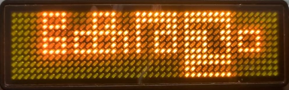
And for more complex cases you would want to use pixelshaper and handtune the glyphs.
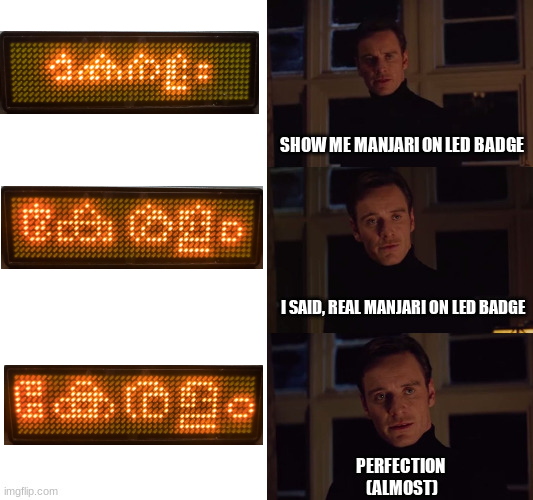
Perhaps someone with more pixel art skills than me can put the dots in the right place to make it look better.
Extending beyond Malayalam fonts and more
Even though pixelshaper was designed with Malayalam as the primary driver, it
is also quite compatible with other Indic languages and also Farsi / Arabic
scripts.
Here is the representation of Santhosh (संतोष in Hindi) and (سانتوش in Farsi
/ Arabic).
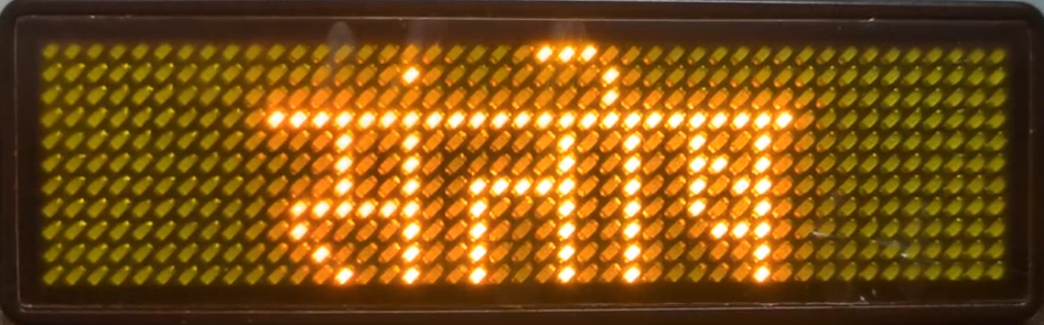
This is rendered using Mukta Devanagari.
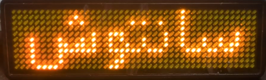
This one uses Vazirmatn.
Special thanks to Seyed Hosseini who helped me test the Farsi conversion, and also helped me figure out some of the edge cases.
I also spent a bit of time making img2badge, which can take an arbitrary image and convert it into a 1-bit png (with the same editable text-art form as an intermediate). You can check out some of the examples I have used to generate tiny logos that fit in the LED badge.
Epilogue
This whole silly adventure started with me trying to display my name in Malayalam in a tiny LED badge. Little did I know it would lead me down so many rabbit holes.
Special thanks to Anthropic and their OSS Claude license, that allowed me to use their Fable 5 to solve this problem.
My main takeaway from this exercise has been how one uses LLMs to solve problems where they have little or no knowledge in that domain. I still do not understand the universe of Typography and Fonts, or how they work in depth, but LLMs fed me enough information that I can take an informed decision on things. The experience went from using an LLM without any knowledge of the problem space resulting in Garbage In, Garbage Out, to using the LLM to gain some understanding of the problem, to coming up with a somewhat working solution. LLMs are quite powerful tools, and even though they are just stochastic parrots, one should not outright dismiss what they can be capable of. And as with any tool it comes with its own set of nuances. I am not going to dive into the aspects of copyright issues, generated slop code etc. — at the end of the day any tool can be put to good or bad use and it depends on the user using it and their intentions. LLMs are here to stay whether we like it or not and learning to use the tool is entirely up to you. Artisanally hand-rolled gluten-free code might become a thing of the past, a leisure time activity, but mainstream is going to be more and more LLM assisted code and it will get into more niche areas as the technology matures.
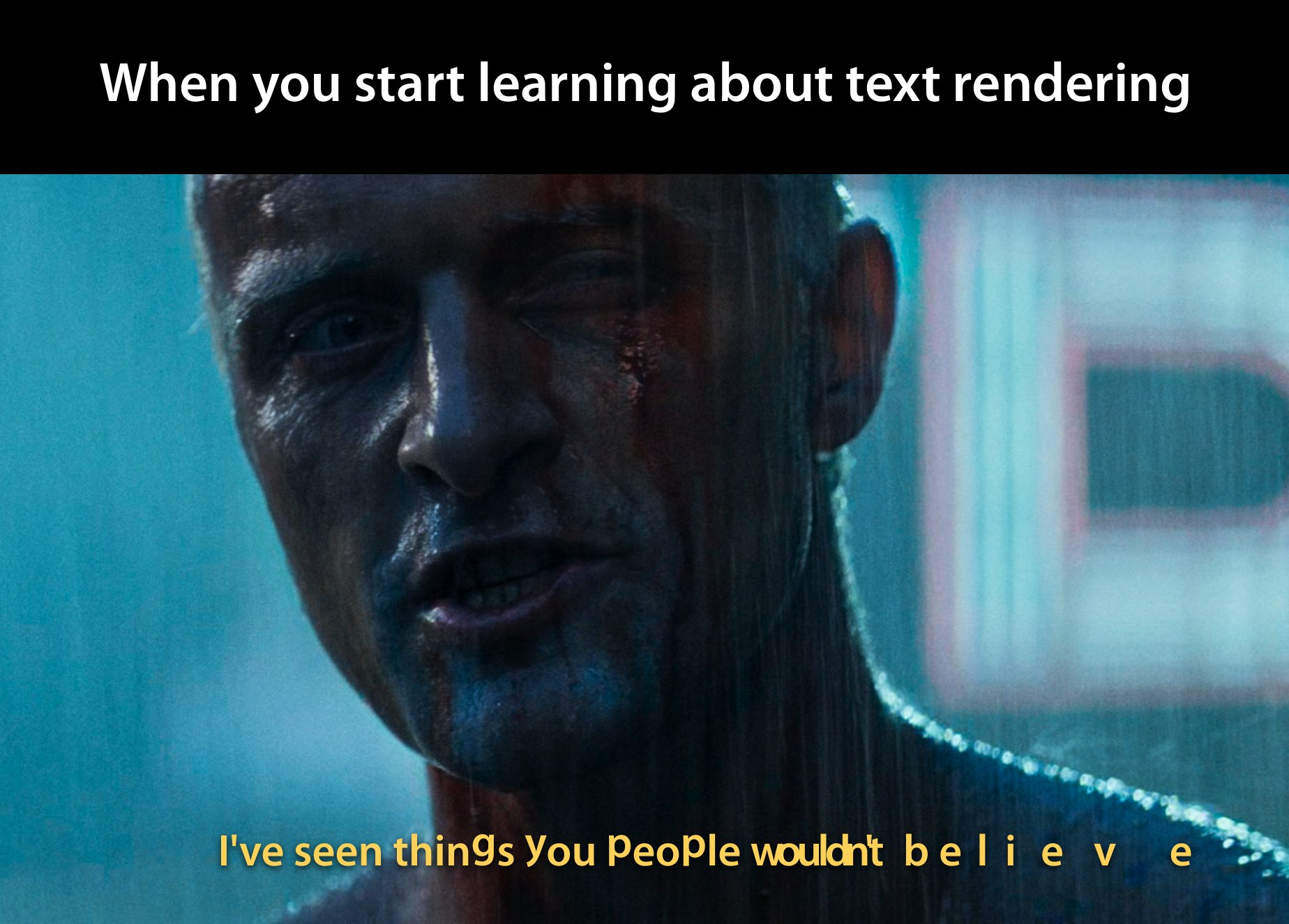
As for Typography and Fonts, my understanding is still limited. I do not know who would be interested in these silly tools I built with Claude, but they are out there in the open for anyone or anything to pick up and use. I satisfied a long standing itch with this — something that, AFAIK, no expert could directly help me out with, and to me this is the game changer: on the contrary, I was able to identify the problem and contribute a more accurate simulation to the Malayalam LED Simulator. Perhaps in time these tools will also be forgotten and fade away, like tears in rain …